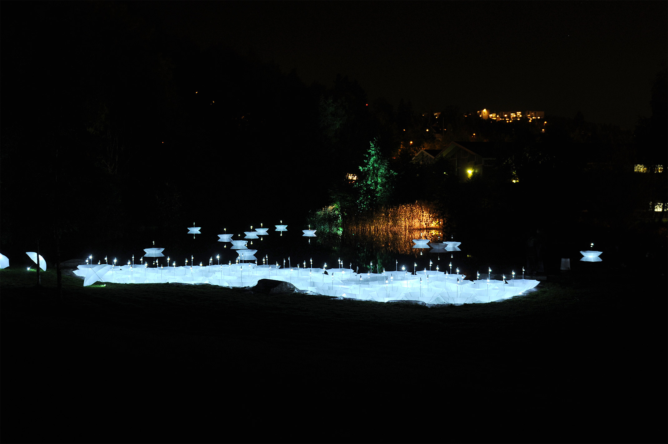
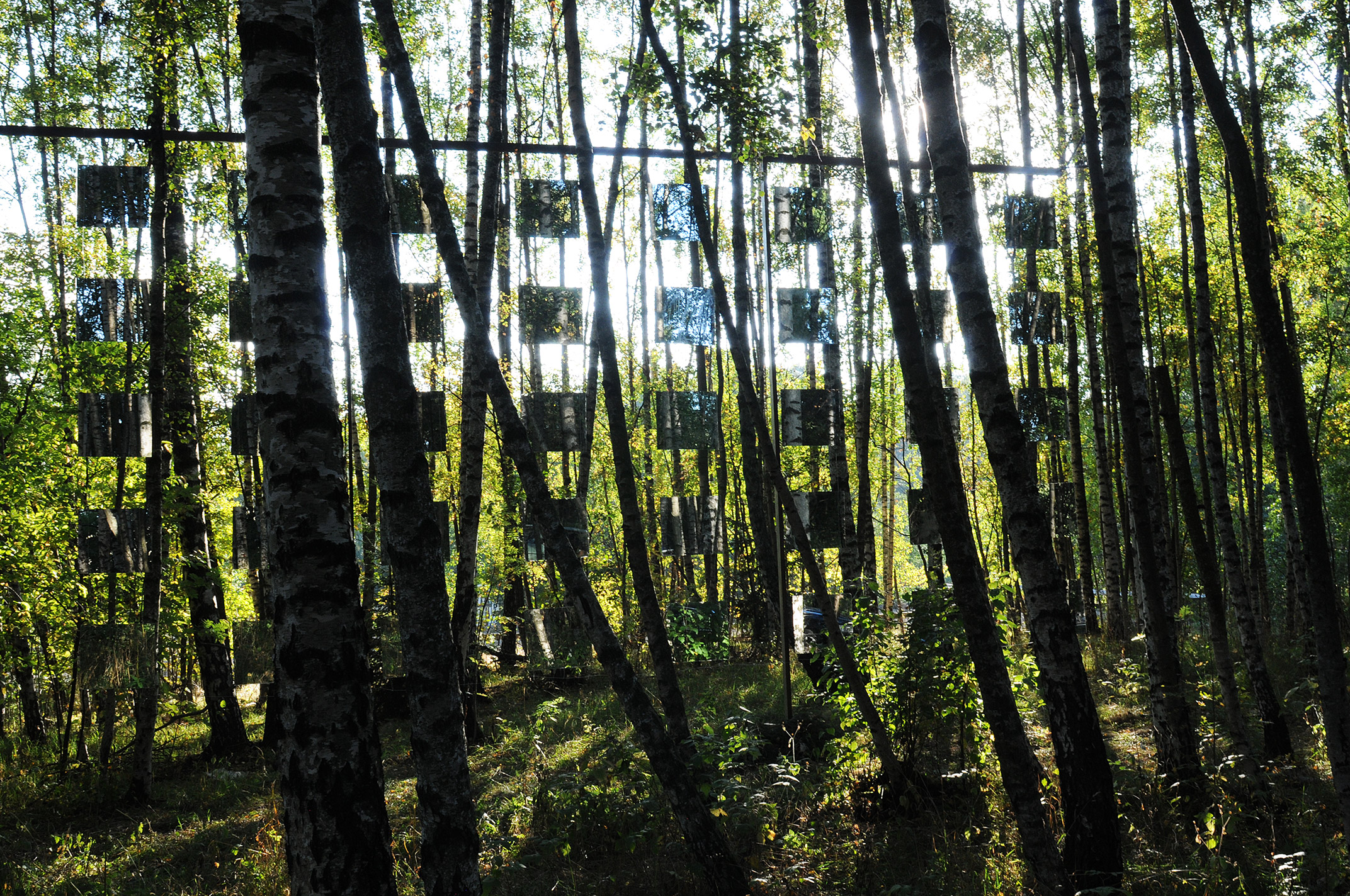
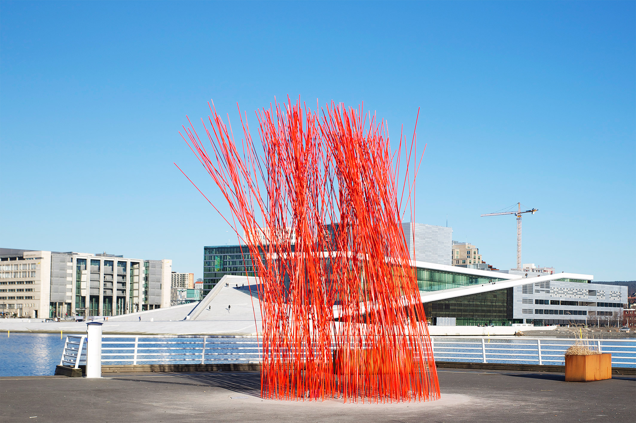
Mesén work in the arts and culture sector managing a variety of projects across Norway, and draws its name from Maecenas, a Roman statesman and early example of a patron of the arts. Projects have included curating the facade of Oslo central station, creating web content for The Norwegian Association for Arts and Crafts, and contributing to development projects in eastern parts of Oslo and Drammen.
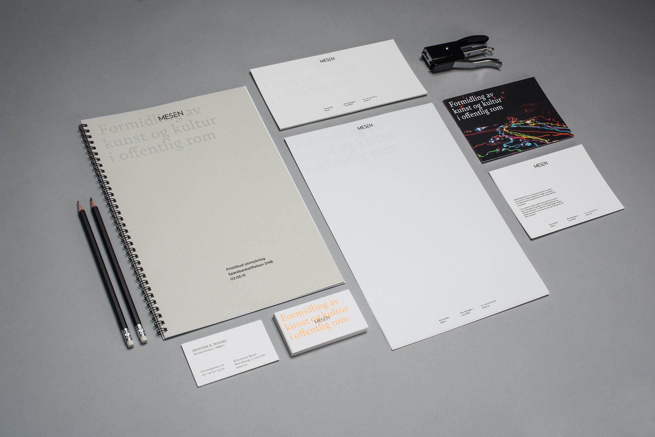
To draw together and communicate Mesén’s diversity of experience we challenged them to define themselves in a single sentence. Formidling av kunst og kultur i offentlig rom (disseminating of art and culture in public spaces) became the brand’s touchstone. We used this touchstone wherever someone encountered the Mesén brand, online or in print. We emphasised its importance and developed a distinctive visual identity from this using a contrast of type size, style and colour.
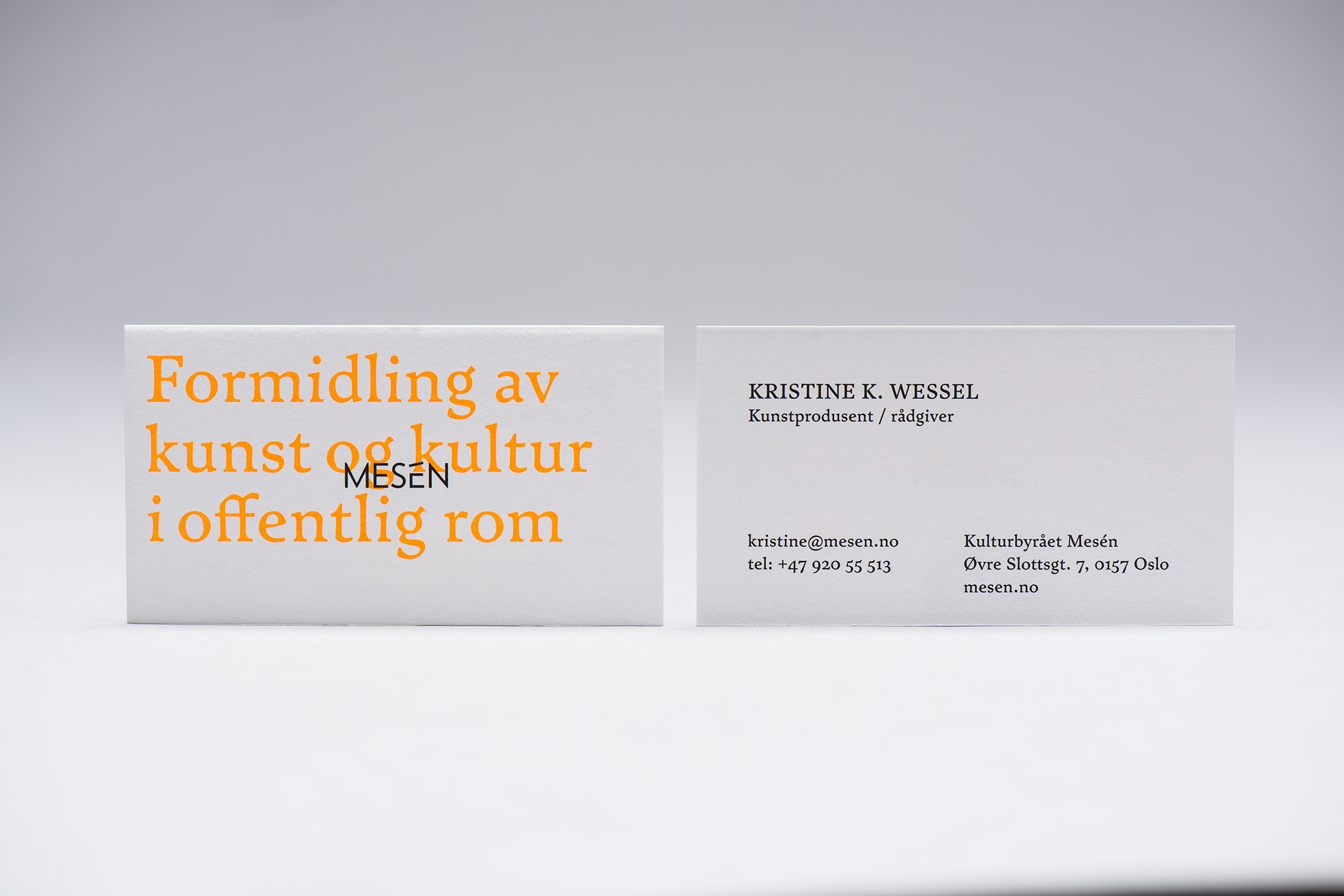
Using Satyr from Monokrom, a Norwegian typeface with a distinct and detailed organic look; a redrawn and reductive logo of geometric form, sharp lines and terminals; bright orange ink over white and grey card, we established a link between contemporary culture and heritage.