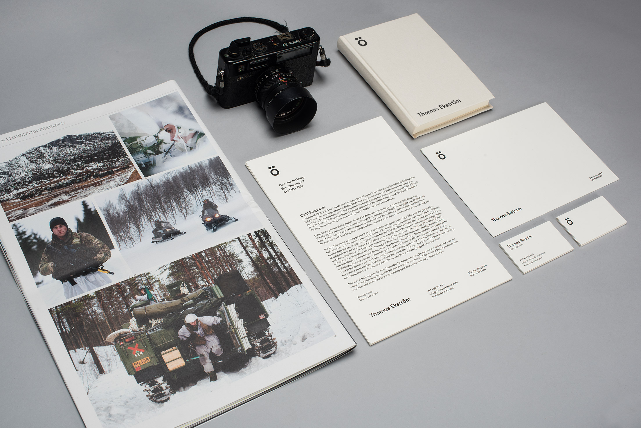
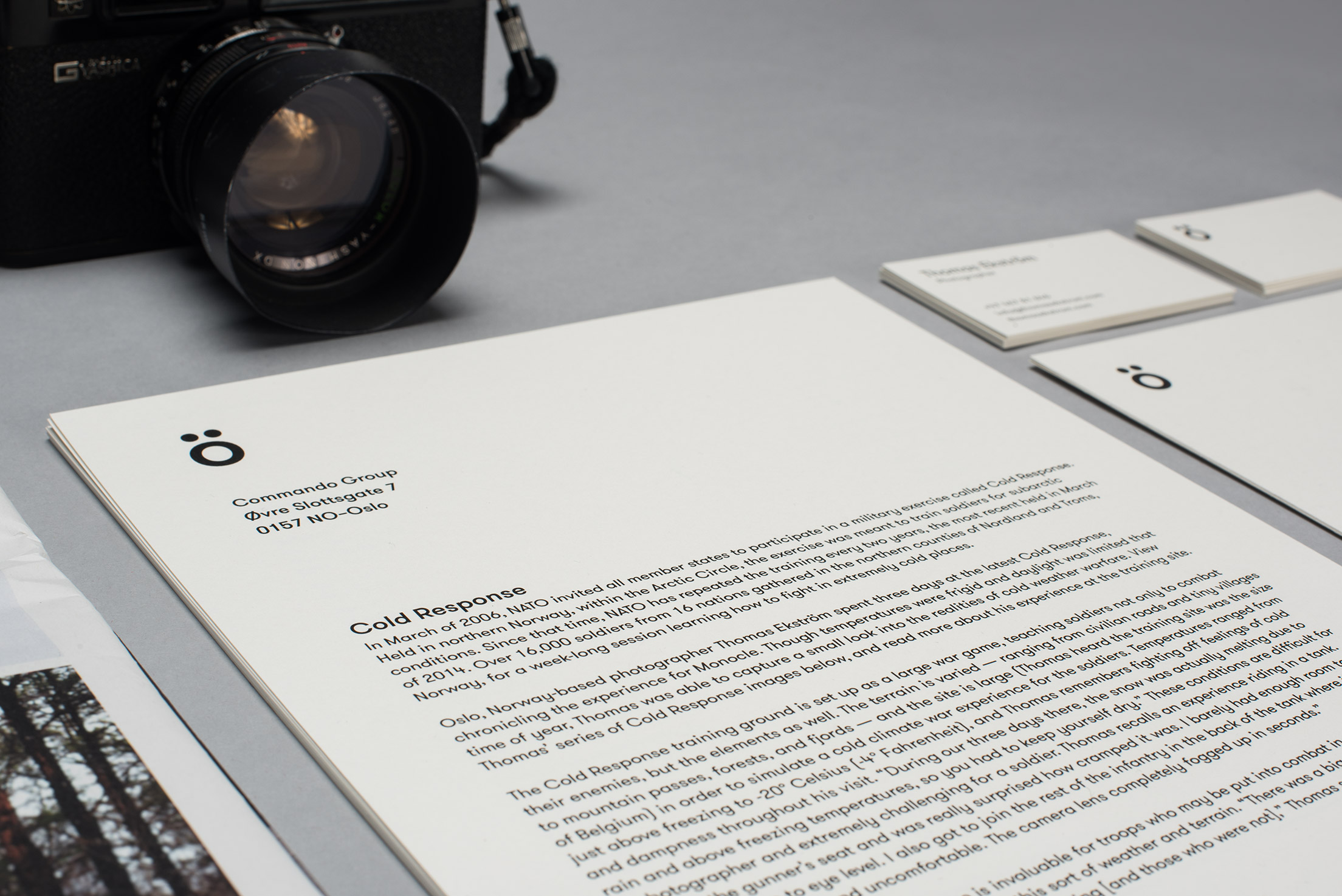
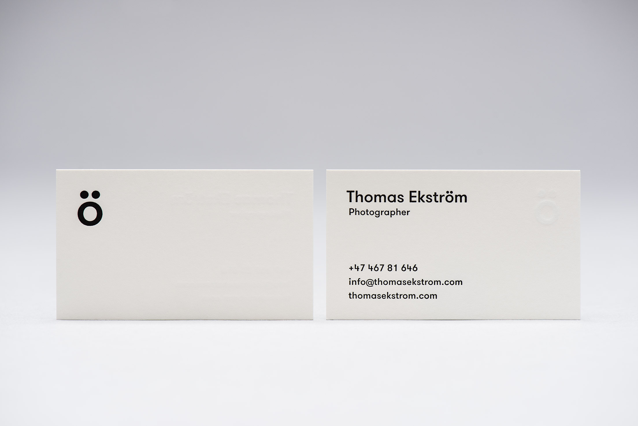
Identity for the Finnish born, Swedish speaking, Norwegian resident and very talented photographer Thomas Ekström. The visual identity is based on Thomas’ un-Norwegian origin by highlighting the umlaut that tells about his origin and identity. The umlaut can be interpreted as a face, a lens with two eyes looking up, or something entirely else. It is used on all surfaces to create an eye-catcher. Combined with the geometric sans serif font GT Walsheim and the cream colored paper Munken Pure we get a professional and masculine expression that at the same time is warm and friendly.


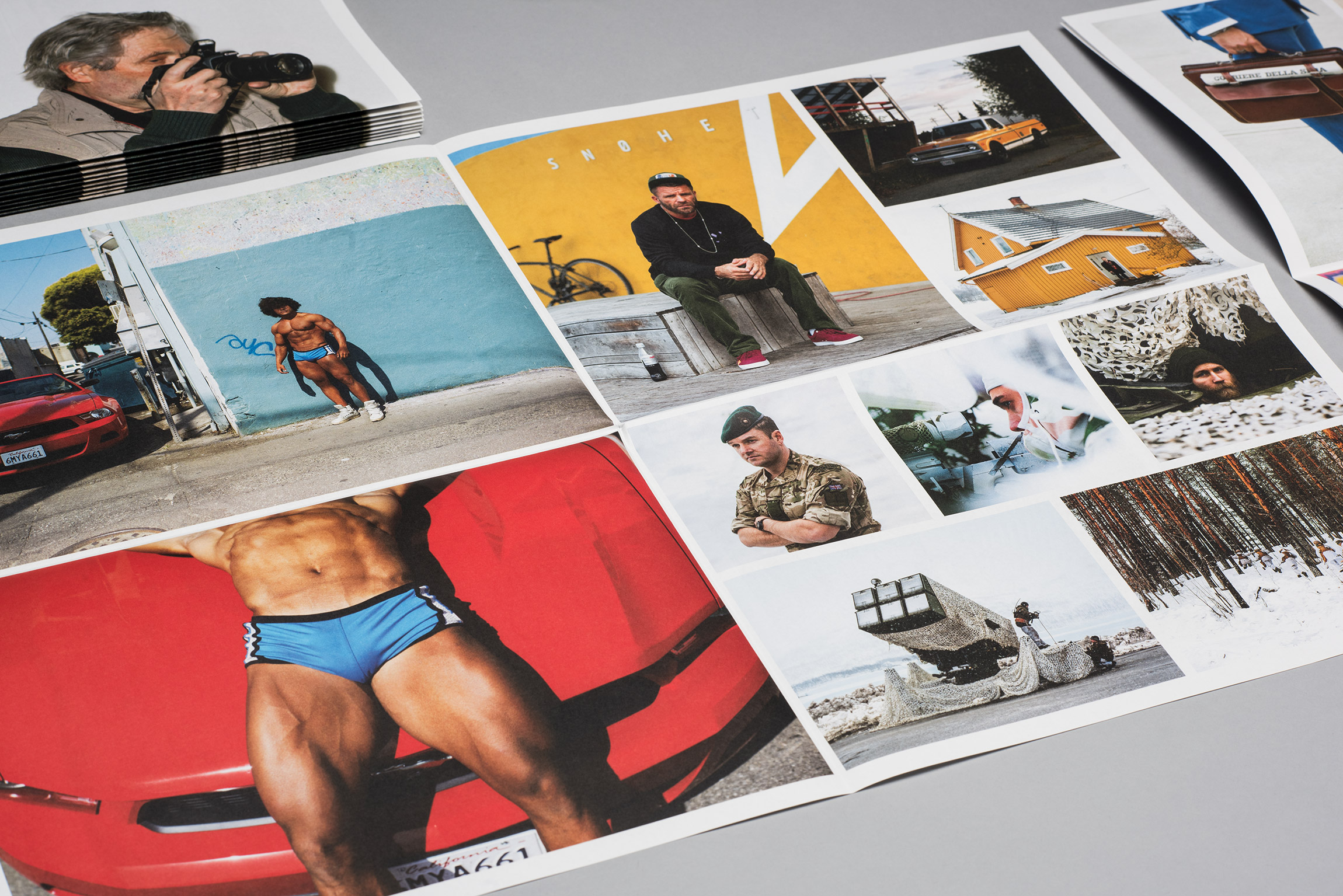
To highlight and focus on the pictures we have kept the website clean and uncluttered without disturbing elements that can change the perception of colors, contrasts and composition. Visit the website.